Monday, April 6, 2020

Distance Learning Videos to Share!

Here's a sneak peek of my "In the Art Room" videos created for distance learning! 


Please use them to share ideas, adopt a lesson to make it your own, or to show to your own students. You can see all of the videos created so far right here:

My Adventures in Positive Space on YouTube

You have all been so helpful to me, and I want to return the favor.

Teachers are amazing. Especially art teachers! As things are unfolding in the world, we are adjusting to creating ways to connect with our students as we are thrust into the world of distance learning. Social media is now in the forefront as we reach out to each other and share ideas for lessons, advocacy, and communication with each other and our students. Thank you for all of your inspiration!

A few weeks ago here in New Jersey, my colleagues and I were given notice to write lessons to post for online learning, and were given very little time. My first lessons were written instructions, and focused on utilizing the home environment. I needed to make sure that lessons were manageable and that all students would be able to accomplish their projects with a variety of circumstances and art supplies at home.

As time away from my students began to expand, and homeroom teachers branched out to things like Zoom and Flipgrid for meeting with and conducting their classes, I thought about how I could connect with my students. I needed to be able to explain things visually and wanted my students to see and connect with me. I was also warned that every teacher could not schedule classes to meet virtually, so as not to overwhelm the learning from home schedule. So I set to work setting up my studio area to create video lessons.

And, kudos to all of the art teacher rock stars out there who already create videos! It is hard work. I fumbled over my words, smacked my lips, said "ummmm" I don't know how many times. Lighting is hard! Editing is hard! Needless to say I had quite a learning curve, and things aren't perfect, but I am virtually available to my students, and have given them ways to create art with choices for recycled materials or whatever art supplies they have at home. I hope these lessons are helpful to you all. 

Be well and safe!

Monday, September 24, 2018

Marc Chagall Self Portraits

I've been thinking more and more about choice in the art room. I definitely try to strike a balance in my teaching philosophy and practice. After all elementary students need structure. They are still learning to use materials properly, the rules and procedures in the art room, and I have curriculum standards to fulfill.

And yet, student choice in the art room reveals a path to a wonderful variety of expression, lends itself to differentiation and increased student engagement. I am finding that when we talk about art, and artistic choices of famous artists, that students are inspired to make their own decisions in how and what they are making. This simple project turned into something magical for me and my 3rd graders as we learned about the art of Marc Chagall.


Our first look at some of Chagall's paintings observations like:
Some people are green, upside down, different sizes.
Some things are floating, or upside down.
Sometimes people or animals are shown as just a face, or their whole body.

We talk about how Chagall made choices as an artist to create his paintings in this way, and students were asked to think about the following: What can we do in our artwork to demonstrate that it is inspired by the work of Marc Chagall?
Show us three things that tell us about you
Create a self or family portrait or memory
Include people, buildings and nature (plants/animals)
Have images vary in size
Use non-realistic and bright colors
Add an unexpected image
Change the direction of objects
Floating or flying people/objects
Create a feeling of happiness
Include a favorite animal or pet

The three things that that tell me something about my students is required, and all of the other criteria work more like prompts. I don't expect every item to be addressed. Those three things are a great opportunity for me to learn a little more about each as we work and discuss our projects. The one thing I do dissuade my students from doing is writing words on their project. Some students are inclined to label things, or just write words instead of draw, so we talk about that as well.

We sketch ideas on a 4x6 piece of paper before moving on to 12x18. And then the process is pencil drawing, tracing lines carefully in sharpie, smaller areas in oil pastels, and painting larger areas in watercolor or pan tempera.

In having choices throughout this project, students care about what they creating. And when everyone's artwork is different, no one's choices are wrong. Here are some of my favorites!


Wednesday, June 21, 2017

Art Adventures: 8 'Till Late, the Felt Grocery Store!

A few years back I read an online article about a British artist named Lucy Sparrow. She had created a temporary Cornershop in London, stocked completely with felt re-creations of everything you would find inside. It was like a cross between a pop-up shop and art installation, and there were over 4,000 items for sale. At the time she hinted at a project in New York and I was thrilled, hoping I would hear about it when the time came. I did. 

Inside the ice cream freezer, with glitter frost on the wire baskets.

So a couple of weeks ago, I got up bright and early, invited my daughter on an art adventure, and into New York City we went. Lucy Sparrow strikes again! On Little West 12th Street in NYC, Sparrow and company opened 8 'Till Late, a little grocery/bodega created entirely out of felt. Here is one of the signs right beneath the High Line.


Sparrow did her research in making a "fauxdega" complete with Americanized products, a bodega cat, meat counter, hot dog stand, and more. She was actually in the shop when we visited, and I regret that I came over all shy and didn't tell her how brilliant she is! Maybe she will read it.

Storefront windows.

Checking out the deals.
Chips, alcohol, frozen food.

It was fantastic. Sparrow's love for simple, brightly colored felt truly lends itself to package design, and her pieces were simultaneously fine art objects and cuddly toys— well, as cuddly as toilet paper or orange juice can be. 

Toiletries.
Chips of all sorts.
Fresh fruit and veggies.
Hot dog stand.
Meat counter and bodega kitty.
The felt register.

Multiples of certain items in plexiglass cases were given finer placement. These soup cans were in a gallery room towards the back of the shop. 


All of these felt items reminded me of a Halloween costume I made way back when my daughter wanted to be a package of Twizzlers. I couldn't imagine making thousands of them, no matter how cute!


We did purchase an item each from the shop. My daughter chose Reese's Pieces, and I chose a jar of grape jelly. I just loved the purple felt! I read that the most popular items to sell out first were Moet Chandon champagne, Heinz Ketchup, Vagisil, Reese’s Peanut Butter Cups, and JIF Peanut Butter. No rhyme or reason I can think of, but a fun fact nonetheless!


My post was going to include an order for you to go and visit ASAP because the shop would only be open for the month of June. Unfortunately the shop is closing today. Over 9,000 items sold out, and there was just no way to keep 8 'Till Late open for the last week or so. Pretty amazing, if you ask me.

I truly enjoyed my visit, and loved the idea of everyday items as art. The simple construction in colorful felt, the pop art inspiration, and connecting to contemporary artists would be an instant hit with my students. I feel an art lesson coming on! 

Friday, June 9, 2017

Color Theory Leaf Paintings

I've been working on different ways for my 5th grade students to collaborate in the art room. We discuss how every child's work has value, and how all of us contributing to a larger creative effort can be a powerful thing. Since I am part time I also find that it helps to assure my presence in the school communities and to make our displays even more impressive. Gotta advocate for the arts! 

Quite a while ago I read about these fantastic color theory leaf paintings on a blog titled Art to the Moon & Back, by Linda Limbach. I thought it was a great way to make a color theory painting more interesting, to allow for choice in the painting, and to create a collaborative mural. Plan for several class periods to create these pieces.


For the first class, I took a walk around my neighborhood to see how many different kinds of leaves I could find, and brought some examples to share with my students. I also made a reference sheet to have available at each table. We talked about organic shapes, symmetry, serrated and smooth edges, and variety in color and size.


  Then each student drew a leaf shape in pencil on 12x16 paper. It could be a realistic shape like the ones we discussed, or they could create an original creation. The only rules were that it had to take up as much of the paper as possible, and that the stem of the leaf should e included, but drawn as a large shape to be able to paint inside of it. Also, if they were going to create a serrated edge, I suggested keeping it simple and stylized to be successful in cutting out their final painting at the end of the unit.


We then divided our leaves into 12 sections. Depending on the design, students either split the leaf down the center first, or did so without including the stem. So on the leaf above, there are six sections on the left, and five on the right, and the stem makes the twelfth. On the oak leaf below, a line was drawn down the center of the entire leaf, and six sections were made on each side. Then students reviewed the color wheel, and named each section along the outside in order, beginning at any point of the leaf they wished. The lines at this point are drawn in the biggest permanent markers you have on hand! And students can even redraw the lines thicker for the main outline, so they will have a generous area of black for the final trimming.


Inside each of the sections we then used a fine point Sharpie to create 4 more areas. There should be a variety of approaches to creating the four smaller sections. In the leaf above, I showed that the easiest way to divide up the stem is with an X. I also explained how the section with the ovals has only three, but the background area counts as a fourth section. Now that the color wheel is completely drawn, the goal is to fill each section of the leaf with the color, and a tint, shade, and tone of that color.


The area around the outside of the leaf can be messy, as you can see. This works for many reasons. First, their color wheel is labeled around the outside, so they don't forget or repeat a color. Their name, class, and table is listed at the top. This is great for pulling pieces from the drying rack and sorting them easily. I also find that many times I have the children write their names on the back of their projects, but when they are on the front I have a prompt for remembering each child's name, their artwork, and its progress. This makes it a great unit for the beginning of the year. And lastly, students can test a mixed color on the outer edge of the paper. Sometimes there is concern over whether a tint is light enough, or if a tone is different enough from the shade just painted. So testing the color on the outside is a great method for testing colors out before applying them inside the final piece.

Final touches are added by cleaning up any lines that were painted over by redrawing here and there with black Sharpie. Then at the very end, make sure students write their names on the back, and carefully cut out their painted leaf designs. Here are some of our finished pieces:


For our collaboration, I created a painted tree on bulletin board paper. It was about nine feet long! All of my students' leaves were added for a wonderful collaborative display. i have to say that displaying the paintings just as floating leaves along the hallway or bulletin board looks great too. I hope you get a chance to create some color theory leaf paintings in your art room. Enjoy.


Saturday, April 1, 2017

Kinetic Drawings

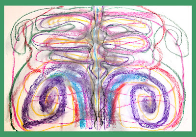
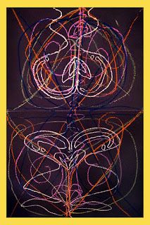
I just finished a unit with my 5th graders based on the art of Heather Hansen. She is an interdisciplinary artist, who combines her work in dance, choreography and drawing to create large-scale kinetic drawings. 


 We talked about Heather Hansen's work, and I showed them a brief Youtube video to give them a bit more information as well as a glimpse into how she works. We made connections to creating snow angels, and talked about the meaning of the term kinetic. We then saw the work of other artists who utilize movement in their work, like Alexander Calder, and Bridget Riley.


Then we began work on our individual drawings. The kids worked with chalk pastels, which I divided into trays, with two pastels of two different colors. They worked with the same pastel color in each hand, concentrating on creating a drawing that was symmetrical, showed various lines and movement, and used at least four colors. As a final touch to their work, students could create "smudge lines" using their fingers. I had them repeat after me, "fingers, not hands" and showed them the difference between creating lines with our fingers, and making mud with our hands. Some chose also to include thicker and thinner lines by utilizing different sides of the pastels.


Space is always an issue since I push into several rooms, so we prepped two 18"x24" sheets of drawing paper with a masking tape seam along the back. Each day as we finished our work, our paper was carefully folded in half to store it for the next class. 

For our collaborative drawings, I assigned partners, they prepped paper, and wrote their names, each on one panel on the back. This way I could grade the finished piece, as well as their individual contributions to it. Also, we could just separate the two halves of the artwork at the end of the unit, so each student could keep his or her own work.


My students were so engaged, and discovered that creating a nonrepresentational work of art can be even more challenging and rewarding than one with a concrete or representational objective. They also reflected on the differences in working on a individual drawing as opposed to working with a partner. I couldn't have been happier with their efforts. Their drawings demonstrated a great variety of line, movement, color, and symmetry. Individual drawings conveyed their choices and personalities. And their collaborative work showed their attention, communication skills, and expression of the lesson objectives as a team. Here are some of our final pieces:

 Individual Drawings in Pastel


Partner Drawings in Oil Pastel


Wednesday, March 29, 2017

Art Teacher Finds—Say Cheese!

While doing my weekly food shopping recently I came upon a familiar face in one of the refrigerator cases. "Why Vincent, what are you doing here? I will have to take you home with me."  Thankfully this conversation took place silently in my mind. 

Vincent joined me as I sprinkled this yummy cheese on top of soups, pasta, and added the rest to a quiche. I never thought I would find an art teacher cheese, but here we have it! Have you encountered any art teacher finds lately? Tell me about them in the comments below.


Wednesday, March 22, 2017

Collaboration: Hearts and Hands Mural

A fellow art teacher on an art teachers Facebook group was my inspiration to create this hand emoji themed mural. (FELLOW TEACHER on Facebook! If you see my post, please reach out to me, I'd love to give you credit for this project!) I enjoy creating collaboration projects as first lessons of the year in the art room. The small size of each students contribution allows for choice. Every student feels successful, I get a chance to assess their skills, and it breaks the ice in the classroom as we all get to know each other. Not to mention we have a beautiful piece of art to hang in the hallway.

One of our finished murals.

I began by searching for a stock photo that I thought would make the best final mural image. Here's the one I chose below. I then printed it out, and placed it on a light box with graph paper over it to plot out the tiled grid. I drew the hand shapes in pencil, and sectioned off the image in red, giving each panel a letter designation. 

I made each square of the graph paper equal to a 3" tile that each of my students would contribute. The paper size for each panel was 18"x18", except for the right most panels, they were 18" x 24". The final size of the mural was 8' wide by 6 'tall.


Plotting out the design.

We discussed the elements of art and my students were given guidelines for their assignment. They had to create at least three tiles to add to the mural, with minimal white space, utilizing the elements of art, and their subject matter had to be appropriate for school display. We used colored Sharpies for our designs, and I provided half sheets of copy paper so they could color all the way to the edges of their tiles without marking up the tables too much.

Creating tile drawings.
As they worked on their tile designs I prepped paper panels, each labeled with a letter of the alphabet. Then I created numbered grids, X marks for spaces that needed tiles, and a corresponding panel beneath them

As the children began to finish their designs, I made several stations each with a panel, glue sponge, and pencil. They were allowed to glue their tiles anywhere that a square had an X marked across it. Wherever they glued their tile, they had to also write their name and class in the corresponding tile below (this helped me with grading, as their names on the back of their tiles got glued down). So in the example, if a student glued their tile to spot #15, they then needed to sign their name and class on the #15 in the smaller panel below. Oh, and see that half-filled diagonal square in the right column? To accommodate the finished image we needed some diagonal designs too. I saved them for extra credit/early finishers. No need to cut the tile in half, just design a half tile drawing, and glue down like a full one. The colored-in areas just needed to match up.

Students add their tiles to the mural.
It was fun to watch how they chose the places to add their tiles to the murals. Some wanted to spread them out by gluing at different stations, some wanted them all together, some chose favorite numbers and so on.


Mural details.
To assemble the mural, I graded their work and removed the lower panels for each piece (hold onto them if you plan to let the kids cut up the mural to retrieve their tiles after it has been exhibited). Then I just assembled in alphabetical order! I taped panels together on the back with masking tape, into vertical strips, and then hung them adjacent to each other to display the mural in full. It's easier to transport and to hang than fastening the entire mural together as one piece. I saved the final reveal for the kids too, so they tried to guess what kind of image our tiles would make each time we worked. Here is the finished piece we made at my second school.
 
The fact that this collaboration culminates with a positive message to share with the school community is the perfect ending to this unit. I hope you try out a tiled collaboration with your kids. Maybe you'll choose a different kind of image to make into a mural. I'd love to see, so share if you do!