Wednesday, November 25, 2015

Snapping Photos at the Art Museum

A fellow art teacher recently shared an article about a museum in The Netherlands, which is discouraging taking photos of artwork at museums, and instead is asking people to take the time to draw an artwork to make for a more appreciative experience. It's a wonderful idea, but it isn't for everyone. And it made me think of occasions when I took the time to visit an exhibition, and was denied the simple pleasure of snapping a photo of the memory all for my little old self.

Monet's Waterlilies at Musée de l'Orangerie in Paris, France.

Don't get me wrong, I love sketching! But I also love getting to take a picture of myself with an artwork I've long wished I could see and traveled to get the chance to do so. Unless I'm a professional photographer with the proper equipment and an empty museum or gallery, I don't see why we shouldn't be able to snap a pic. My image is no threat to them, especially if I'm in front of it. Certain works of art are major destinations for me! 

Keith Haring at the Brooklyn Museum, NYC. 

What if I traveled to Disney World or Niagara Falls, or wherever, and was told I could sketch it only? What if I'm not an artist, but appreciate art and have no desire or skill to sketch things? I've also had circumstances where sketching was only allowed in pencil. How does that help me appreciate great color or brush strokes. And how much longer would I need to stand and sketch something than to look at it and take a picture so others can have their opportunity? Like I said, I love to sketch and do sometimes sketch on a museum visit, but having a photograph to celebrate a wonderful memory for me is different and I feel should still be permitted. Especially to share as a blogger. I would think the museums would like the publicity for their exhibits!

For example, here is an exhibit on Italian Futurism I went to at the Guggenheim. No photography allowed. I took a photo in the lobby, the only place I could that had anything to do with the exhibit. 

Futurism Exhibit at the Guggenheim, NYC.

That same day we happened upon a public piece of art on East Houston Street, and guess what, no one denied me a chance to have a go at a photo! Thank you Maya Hayuk!

Maya Hayuk Mural, NYC. 

Which is more memorable and important to me? My record of experiencing the mural of course. It helps me to remember the weather, what I wore, which was Futurism inspired by the way, and for a blogger, this is a great experience to share over signage!

 On a trip to Washington D.C. I captured the pieces that resonated with each of my daughters at the time. My little one loved the childlike nature of this painting and it made her happy. My older daughter loved the painting that made her think about how much she loved her kitties. I think these are wonderful milestones and can look back on the photographs and remember exactly what their thoughts were, and that I was helpful in fostering their appreciation for art and museums.
 
My younger daughter enjoying La Ronde des Images by Jean Dubuffet,
Smithsonian National Gallery of Art, Washington DC.

My older daughter enjoying Woman with a Cat by Auguste Renoir,
Smithsonian National Gallery of Art, Washington DC.


And me in front of Alexander Calder mobile in I.M. Pei building,
Smithsonian National Gallery of Art, Washington DC.

So what do you think? In the digital age, should we be allowed to take more pictures of the artwork we view in a formal setting or fewer? Does it devalue the works or make them even more important? Do you have a preference as to whether to sketch or snap a photo on a visit to a museum or gallery? Do you have any favorite photos of your art experiences? If you share some with me via email, I will add them to a future feedback post! Be sure to include your name, the artist and/or title of the artwork pictured, and where it was taken.


 You can check out the article inspiration here.

Saturday, September 5, 2015

Last Summer Days

Well, the final days of summer are here. I know many of you have already begun teaching classes, and I'm right behind you! I've unpacked, reconnected with staff, and have had days of intensive professional development. Whew! It's back to school next week, but this weekend I do get one last family getaway. 

Here's a little summer art project created by my family to let you know that I hope you enjoyed your summer, and that I wish you well this upcoming school year.

Be well, and enjoy your many adventures! 


Sunday, August 23, 2015

A Special Student Thank You!

I stopped by the main office of one of my schools this week (yes, the start of the school year is upon us). While I was there I checked in on my mailbox in the main office. You know, sometimes I miss important things in my mailbox here or there because I travel between schools. Things can just sit there for a week or more with a 6-day schedule, and a weekend thrown in.


Well, apparently I missed this treasure left for me at the end of the year. It is a student drawing inspired by Romero Britto, with a note thanking me for our recent mural project. This made my entire week! Please, if you have a teacher that deserves a thank you, take the time to give it. It is something we all appreciate— more than you know!

Wednesday, August 19, 2015

Vincent van Gogh Giveaway Winner

Thanks to everyone who entered the contest for a free copy of Vincent,
by Barbara Stok. You all had great stories to share. I especially loved seeing pictures
of you dressed as Vincent, recollections of lessons taught and learned, and even got
the scoop on a free van Gogh app! So fantastic!
 
 
Congratulations, Katelyn Smith!
You are the winner. Hurray! 
Look for your package in the mail, find a comfy chair,
and have a great read.

Wednesday, August 12, 2015

Middle School Mural, Part Three

Our mural is complete! HURRAY! 

Here are a few suggestions/learning moments I would like to share for those of you with a yearning to mural, or to help your next mural go more smoothly.


We used Sax True Flow acrylics and they worked well. We mixed a little white into each color to give them better opacity. The lightest colors did need an additional coat— and go figure, I realized later that Sax makes a Blockout White, which probably would have been a better way to go! Live and learn. The kids used restaurant cups to carry their paint over to the mural. And I just snapped the lids on and saved them for the next week! Unless there was near nothing left in the cups, the paint stayed moist and usable throughout our five weeks of meeting to work on the mural.


Once we got rolling and past just filling in large areas of color, my students were so motivated that I became a little overwhelmed with many of them asking over and over and/or simultaneously "What do I do now? What's next?" I had about twelve students, for a 6 foot by six foot space. Not everyone could work at the same time, and sometimes with so many working, I could not look to see what needed to be done! So, at the end of each work day I would take a shot of the mural in progress, and before the next meeting, I would mark all of the areas that needed work with a post-it note. Voila! Students could pick an area, pull off a note, and get to work. I also had students washing brushes, filling paint cups, and mixing colors as we needed them. And lets not forget the emergency clean up crew! Damp washcloths at the ready just in case of spills, paint on clothing etc. 


 We had the printout of the image hanging nearby for reference as we worked. For circles and stripes I hung up sheets to practice on. Having a chance to try filling in these areas before heading to the mural gave the kids confidence, and helped their work to be its best. I still found that straight lines were tricky, barring masking every line with tape. So in smaller areas, we opted to make free-form lines, and dab dots. The kids could practice them on the practice sheets as well, and they still gave the look and feel of Britto's original work. They also painted the free-form scribble patterns free hand.


For the final stage of adding black outlines, I painted the outside borders for the kids to fill in, and painted some areas myself. Once you get so close to the finish, you don't want anything to go horribly wrong. And at this point, precision is key!  We managed all of the final touches with success.


This really was a great learning experience for the kids, as well as for me as a teacher, artist, and life-long learner. I also enjoyed the many students and staff who walked by and stopped to give encouragement, thank me for contributing to brightening up our hallways, and find out who I am! Being a part-time teacher who travels to two different schools, I don't always get to feel as much a part of each school's community as I would like. This was a wonderful opportunity to get to know everyone. And I'm glad my students will be able to walk by our mural and know they were part of it for their years at middle school. Great job young artists!

 To see the other stages of our Romero Britto mural, check out these previous posts...

Middle School Mural, Part One

Middle School Mural, Part Two

Thursday, August 6, 2015

Vincent van Gogh Giveaway!

I recently found this wonderful graphic novel all about Vincent van Gogh and his years spent in Arles. It was created by a Dutch artist/author named Barbara Stok, and her simple and brilliant visuals are a joy to read. Here she talks about her inspiration:

"I chose the last couple of years of his life, the period he lived in the south of France, because it’s an extremely interesting time. There was a lot going on: he made his most beautiful paintings, he dreamed about setting up an artists’ house, there was the tragic incident with his ear and, finally, he went to a mental institution. He had hopes and dreams and big disappointments, but in the end he found resignation and consolation in his work and in nature."

 So now I want to share— literally!
Welcome to latest Positive Space Giveaway! Woo hoo!


To enter: please become a member/follower of my blog if you haven't already, and then leave a comment below with a favorite van Gogh anecdote. Maybe it's the first time you viewed one of his paintings, your favorite or most successful art lesson. Perhaps you dressed as him for Halloween one year? Hmmmmmm? Too bad you can't see the candles on my, err, I mean his hat. One winner will be chosen from the comments, so make sure you leave a way for me to contact you within your comment!


The giveaway is open to residents of the 50 United States (and DC), ends on August 15th, and will ship within one week. Read it yourself, share with a friend, and depending on what age range you teach, share it with your students. I would suggest high school only. Caution: nudity, some naughty language, and the ear is dealt with—enough said.

Good luck my art teacher friends, and hope your first days of school run smoothly! And well wishes to all of my online family!

Monday, June 8, 2015

Middle School Mural, Part Two

Progress continues with my 5th grade Artists of the Week, as we create a new mural for our school. Here we are on Day Two, blocking in solid areas of color. 

  We are copying a masterwork of the contemporary artist Romero Britto.
He is a Brazilian-American and his work is part cubism, pop art and graffiti.
"Britto uses vibrant colors and bold patterns as a visual language of hope and happiness, reflecting his optimistic faith in the world around him." What better way to beautify
our school environment than to pay tribute to an artist with such a wonderful way
of looking at the world!
These kinds of projects are so wonderful and accomplish many goals for a school community, including beautification, school spirit, teamwork, and participating a large-scale community artwork.  
Even though students consider this a fun afternoon activity, the are learning how to cooperate, how to paint on an upright surface (not an easy task), and how to scale an image by using the grid method. They are also learning about breaking down an image into stages that help to recreate it in an order that makes sense: large broad flat areas of color, smaller patterns and details, and final outlines and accents.

Please check back for updates and pictures of the finished mural.
 

Monday, June 1, 2015

Great Art Sites for Kids—Artopia on PBS

On the website for my local PBS station, I recently found Artopia. Here you can watch the pilot episode of the children's cartoon featuring the young artist Nina, and her two best friends/creations named Little and Streak. In this episode, a stained glass king has his crown stolen by a monster, and the trio venture into Artopia to track down the monster and retrieve the crown.


Along the way they meet creations of art from different parts of the world, and from different time periods depicting various monsters and creatures. There is also a game where you can create your own monster using different body parts, colors and patterns, as featured in the show. Here's a monster I created using the head of the demon Arghan, from India, and the body of Skylla, a beast from Greek mythology.


Unfortunately this series didn't take off, so I think that's why the "Share What You Think" section is now defunct. But it's fun to watch the episode and design some monsters. It was great timing for me to find this site, as I am currently working on a lesson with my 5th graders about gargoyles, grotesques, and chimeras! And there's a special place in my heart for red-headed artists! Have a look and create a monster or two.

Wednesday, May 27, 2015

Middle School Mural, Part One

What happens when water fountains are replaced at your school, and you are left 
with a big gray wall when all is said and done? Well, sometimes you are very lucky 
and your principal thinks of you.


 You are given a blank canvas and the chance to work with some of your students 
on something special to make six square feet of space come to life!


You find just the right image to brighten things up, that will be appropriate for the school environment, give an opportunity for learning, and will be achievable for your students. You plan, sketch up a grid, and transfer your image onto the wall. 


And then you and your kids get to work! Oh, and you remember to bring a better camera to document the rest of the project! More to come.

Wednesday, May 20, 2015

Animal Drawings Inspired by Laurel Burch

5th grade students and I recently studied the work of American artist Laurel Burch. 
Her stylized animals and use of pattern, metallic accents and outlines are always a winner with kids! 


Although I don't have a completely choice-based art curriculum, I find that there is usually room for lots of choices within a lesson. For instance, there was a choice of background paper color. We had just created a project on black construction paper, so I gave a choice of burgundy, dark blue, or brown. These colors were still dark enough for colors to pop, but gave each piece a bit of personality.  


Students also chose whether to use a starter template of a few different animal designs inspired by Burch's artwork, or to draw an original animal idea. I also gave them the choice between using construction paper crayons or colored pencil. 
(The one rule here was not to combine the two media. Although they both work well, when used together, the crayon can make the pencil seem dull.)


It seems that freedom of choice was a hit! When it came time to add metallic outlines and accents with gold sharpie, many students asked for a choice in color. I only had gold in my inventory, but told the students that they were helping out my students next year, because I would be mindful of adding other metallic colors to my supplies. They were happy that their requests were taken seriously, and that they would influence a change in the lesson in the future. Enjoy!

Tuesday, May 19, 2015

Been Blogging? Want to trade links?

Hi fellow art teachers, bloggers, and web friends! As you can see I am reviving this blog of mine, and have noticed some of my links to great art sites and fellow bloggers have expired. Our lives all have an ebb and flow, and sometimes we move on to other things. And sometimes we (by we I mean me) realize how much we need to make time for the things that we love, and which feed us with inspiration, creativity, knowledge, and virtual camaraderie! 

So I'm calling out to you! Been blogging? Want to trade links?


Please, comment here with your blog address and name. Or email me at positivespaceart@gmail.com. As long as your blog is current (you have posted in the last month or so, and post at least once a month), its content is about your art teaching experiences, lessons, and examples of the work of yourself and your students, and preferably add free, I will add you to my list of Amazing Art Teacher Blogs. And please add me to yours.

New posts, links to cool art sites and an updated list of Amazing Art Teacher Blogs are all coming soon! I even brought the Feed the Fish app back. I know, I know, it's silly, but it's always been my favorite widget!

Monday, May 18, 2015

My New Favorite TV Commercial

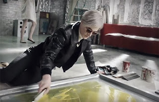
There's a new TV commercial airing sponsored by HGTV, Sherwin-Williams, and Lowe's featuring some very familiar faces. Have you seen it? Take a minute to watch!


Thursday, May 14, 2015

Mark Crilley Visits NJ! Part Two

So the wheels were in motion to have artist and author Mark Crilley visit with the help of our local PTA. Unfortunately it was too late in the school year to plan for a program, so they suggested that we try for the following school year. This was great news and all went ahead smoothly, even surviving a change in the PTA president. She and the media specialist made plans and room in the budget for a day of author presentations and a drawing workshop at one of the middle schools. 

Success! Right? Well almost. You see, this plan began with my private students who ranged from elementary through high school, and who attended public and parochial schools. And of the students who signed the petition at the one middle school, many of those moved up to the high school the next year. So what about students who didn't necessarily attend the one school that did accept our request? My daughter and I were so happy to be getting Mark Crilley to come see us, but we really wanted one more appearance where anyone who was a fan could come see him locally.

Mark Crilley draws as he talks about his career in the visual arts.

Students attend the drawing workshop.

I had one more idea up my sleeve, and went and asked for help. We are customers and fans of our local comic shop, A Little Shop of Comics right here in town, and the owners are fantastic. Their shop has a room they use for gaming and events, and I asked if they would help host a local Mark Crilley appearance for anyone in town to attend. They agreed and so did Mark. We were set! The shop had its biggest turnout for a comic artist paying a visit, and lots of fans and art students came out to hear him speak and sign autographs.


Mark Crilley and my family at A Little Shop of Comics.

Mark Crilley with Steve and Lena at A Little Shop of Comics.

Mark Crilley titles at A Little Shop of Comics.

Signing autographs.

I hope this helps anyone who may be thinking about or actually in the middle of efforts to have a visiting author or artist come to their town. My students, and my daughter especially proved to me that persistence, flexibility and a positive attitude can make things happen. And I have to say thank you again to Mark Crilley for his communication, his visit and amazing presentations, drawing workshops, and personal attention to his fans. It was indeed a pleasure having him spend the day with us!

My autographed copy of Mastering Manga.
 
One other thing I have to mention. Mr. Crilley was so appreciative of our efforts, 
and particularly the efforts of my daughter who had sought out her media specialist, 
and circulated petitions to fellow students to sign in favor of having this author visit. 
He gave her a very special gift: one of his pencil drawings featured on his Youtube channel. Thanks again Mark Crilley!
 
A lovely gift!